Saturday, October 6, 2018

FLIGHT


Spacecraft or subterranean ship of some kind. New sketch from my sketchbook. Pen and Prismacolor markers. I've been enjoying working with simple shapes and limited color. I'm aiming to make screen prints in this realm.


Wednesday, September 26, 2018

BETA RADIO - REALISTIC CITY LIVING (OFFICIAL VIDEO)


I shot this music video for Beta Radio recently on S16mm film with a Bolex, in collaboration with director Sean Wehrli. 
Directed by Sean Wehrli: https://vimeo.com/seanwehrli
Cinematographer: Jeremy Rumas
Producer: Damani Adadevoh
Costume Designer: Alissa Wehrli
Hair & MUA: Mary Chipman
Colorist: Kath Raisch at Company 3
Starring:
Juliet Doherty
Darien Willardson
Ian Weglarz
Yves Oubida
Llewellyn Doris
Shot on Kodak Motion Picture Film


Wednesday, January 11, 2012

the boy hero

I digitally painted this one for my brother.

Thursday, February 17, 2011

kaboom and friends


More of the bug designs...these were all the initial exploration drawings, before I did the final character design and turn around posted below.


Wednesday, February 16, 2011

kaboom


I named this guy Kaboom, as he's a bug whose endgame is maximum carnage in your kitchen at night. I designed this guy for Protokulture in Chicago. They made the 3D model based on my designs and are planning on animating him. www.protokulture.com

I purposely did not make him symmetrical. I don't like how a lot of 3D models are perfectly symmetrical. I doubt any living creatures are perfectly symmetrical. I tried to play it up a bit with this guy.

Saturday, February 5, 2011

agave


I drew these for Digital Kitchen, Chicago. They ended up making a 20+ foot high installation piece. It's inspired by an agave plant. It was lit up from the inside and changed colors. This was for Jose Cuervo. They took it around the country on a tour.

The drawings above I drew really big with marker. My job was to come up with the initial visual direction for this installation.

First off a I drew a bunch of thumbnail sketches, four of which are here. The art director liked the ones on the right, so that's what I based the top and front view drawings on.

I even made a little model out of wire, plastic, and wooden rods to help visualize how each petal would intersect the base. For the final design, I had the nine petals protrude from the base/core in a spiral pattern upwards. When I looked at photos of the core of a real agave, this is how they grow out, in a spiral pattern around the core. I had about two days to come up with this stuff(there were a lot more exploratory sketches involved also...the ones in this post were the selects).

Digital Kitchen had a 3D modeler make a cg model based on my designs. They took this out to tequila headquarters, along with my drawings and the little model, and Cuervo liked it. DK then went to work modeling a version that would be able to be easily put together and taken apart, have visuals projected from the inside. as well as withstand storm force winds.


This is how it finally turned out. They ended up adding a few extra petals. It's not exactly what I drew, but I really dig how it turned out. It won an award here: http://www.ifaipublications.com/iaa/articles/1401_cuervo.html


Tuesday, December 14, 2010

cartoon network


Cartoon Network Cinemedia from Chris Green on Vimeo.

Here's something I did some initial concept sketching for earlier in the year. This was for DK in Chicago. I had a day to sketch designs of how the interior of this storefront could change shapes to include in their pitch to the client to try to get this job. I first did a bunch of small thumbnail drawings. Then Chad, their cg art director, picked which ones he liked and I drew the three key frames bigger, that's the first image at top.
DK got the job, and so the next day I came in and in the morning they asked me to kick out a few designs for the exterior of the storefront.

Thursday, November 18, 2010

the dead city at night


Messin around with gouache tonight. Had fun with this one. Expanding more on the world I've drawn some of in some earlier posts. This is supposed to be Denver in the future.

Tuesday, November 16, 2010

neon fireball guitar solos


click images to see super-mega-ultra-up-sized versions...

Earlier this year did some preliminary character design work on a project at Calabash Animation called Eternal Descent. These guitar god characters battle each other with guitar solos and lightning bolts and neon pink atom bomb feedback.

02/03/11...added some more development sketches to this batch.

Tuesday, October 26, 2010

kaleidoscope street


Here is another page in my sketchbook that started as a couple different thumbnail drawings next to each other. As I looked at them, I thought they might blend well together, and then I just kept adding on. Did not at all plan on the trippy multi-dimensional intersection. But I dig how it turned out.

Monday, April 19, 2010

Squid vs. Whale


The colossal squid vs. the sperm whale.

Saturday, March 13, 2010

daniel jones


This is a brush and ink drawing I made recently for the surf film I'm working on, hangs upon nothing. This one got published in the last Surfer's Journal overlayed on a photo sequence of Daniel's brother, Mikala. I just made the mat this weekend.

Sunday, February 14, 2010

Imperious Rex


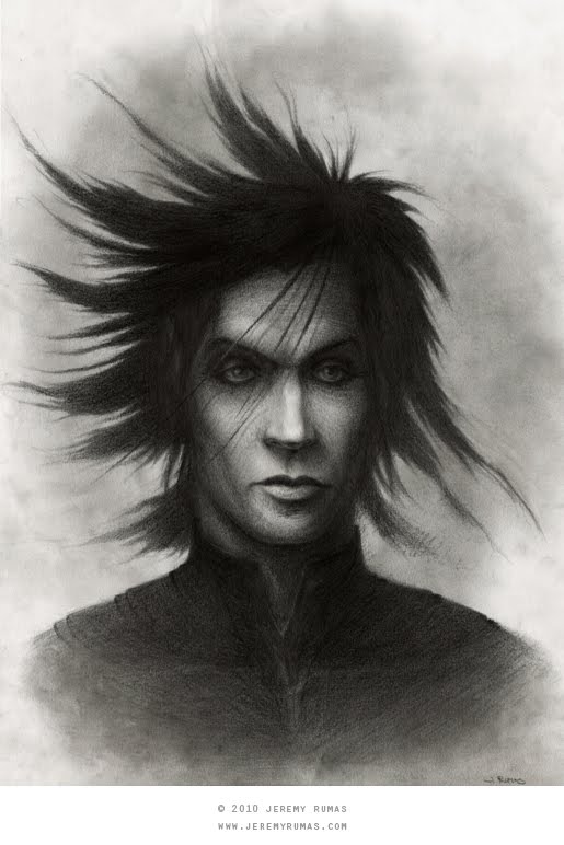
Here is a portrait of Namor I kicked out over the last couple days. Inspired by some of the really impressive portraits I've seen over at conceptart.org recently, I decided to try and dip back into a type of more realitic drawing I really haven't attempted in over ten years. Trying to go back to the basics, and relearn or learn for the first time the foundations of drawing and painting.

I did most of this from imagination and looking at some previous sketches I've done of Namor. I also used a WWII US Army portrait of my grandfather as reference. He was seventeen or eighteen in the photo(he lied about his age to get into the Army to serve in the war), and had the looks of a movie star. In the photo he's turned the other way, and its a happy, proud looking portrait. I just used it for a bit of reference in regard to the nose, cheeks, eyes, and neck. This drawing doesn't look like him, and I didn't try to make it look like him. But the nose is pretty similar. I find that there is something timeless and magical about old photographic portraits. Hard to describe, but they just often have such a strong prescence.

In other news, my grandpa, still alive and full of kick, is now on facebook. He's beat me to it. I guess that means my grandpa is hipper than me.

Friday, February 12, 2010

Sunday, January 31, 2010

silos


Exploring color ideas on translucent yupo. This translucent yupo stuff is pretty interesting as you can lay it over an existing drawing and do an overlay without using a lightbox. And it will also take watercolor without warping. It is tricky to use though! Ink does not dry quickly on yupo as it does not absorb. And going over an area with a wet brush that already has dried paint on it can lift that paint right off, depending on how you hit it with a brush.